

Exploring UI Development with Storybook and React CVA
Introduction
Welcome to my blog that will take you on a deep dive into two powerful React libraries: Storybook and React CVA. In the world of User Interface (UI) development, sustainability, testing, and documentation are crucial aspects. If a project is not well-documented, it can lead to significant challenges.
Imagine you or your team working on a large and complex React project. Without adequate documentation, onboarding new team members becomes a formidable challenge. How will they learn about the reusable components we've built? How will they know what props can be used for each component? This is a real issue that can hinder productivity and collaboration.
In this blog, we will tackle these issues together by leveraging two fantastic tools: Storybook and React CVA. Storybook will help us build, test, and document UI components in isolation. Meanwhile, React CVA will bring ease to writing CSS styles with TypeScript without compromising the clarity of documentation.
So, let's explore how the combination of Storybook and React CVA can be the key to creating easily understandable, reusable, and well-documented React components. Get ready to leave behind the complexity of manually naming classes and types, and let's focus on the exciting aspects of UI development. Happy reading!
Setup
The first step is to initialize or set up our project. Follow the steps below:
Create a React Project with Vite
In this demo, I will showcase using Vite. Open your terminal and type the following command, adjusting the configuration as needed:
npm create vite@latest
√ Project name: ... storybook-reactcva-demo
√ Select a framework: » React
√ Select a variant: » TypeScript
Once finished run:
cd storybook-reactcva-demo
npm install
npm run dev
Make sure to perform the same steps and We've just finished setting up our React project using Vite.
Install Required Libraries
In this demo, we will use three React libraries: Storybook, CVA, and Tailwind CSS. Let's install them now, following the steps below:
Install CVA
npm i class-variance-authorityInstall Tailwind CSS
npm install -D tailwindcss postcss autoprefixer
npx tailwindcss init -p
Open the newly added tailwind.config.js file after finishing the installation of Tailwind CSS. Replace its contents with the following:
// tailwind.config.js

/** @type {import('tailwindcss').Config} */
export default {
  content: [
    "./index.html",
    "./src/**/*.{js,ts,jsx,tsx}",
  ],
  theme: {
    extend: {},
  },
  plugins: [],
}
Then, open the src/index.css file and replace all its contents with the following:
/* src/index.css */

@tailwind base;
@tailwind components;
@tailwind utilities;
Install Storybook
The last library we will install is Storybook. Follow the steps below to integrate Storybook with our React Vite project:
npx storybook@latest initAfter successfully installing all Storybook configurations, the Storybook studio will automatically open in your browser. However, if it doesn't open automatically, you can still open it by running the command npm run storybook in your terminal. The interface should look something like this:
The advantage of using Storybook for documenting our reusable components is that the UI part of this Studio is separate from our main project. Therefore, there's no need to create a new page just to display which components can be reused. Additionally, the Storybook Studio comes equipped with powerful tools that greatly assist in developing reusable components. It proves to be invaluable for both developers creating reusable components and those seeking to understand these components within our project.
Integrating Tailwind CSS and Storybook
I will demonstrate how to make Tailwind CSS work in our Storybook. Despite installing Tailwind CSS initially, it only functions for our React project and not within Storybook. As mentioned earlier, our main project and Storybook, although stored in the same folder, are separate entities.
Inside the src folder, create a new file named input.css, and fill it with the following code:
/* src/input.css */

@tailwind base;
@tailwind components;
@tailwind utilities;
Then, open the terminal and execute the following command:
npx tailwindcss -i ./src/input.css -o ./dist/output.css --watchIn the root folder of our project, open the .storybook folder, and within it, open the preview.ts file. Import output.css into this file:
// preview.ts

import type { Preview } from "@storybook/react";
import "../dist/output.css"; //import your output.css here

const preview: Preview = {
  parameters: {
    actions: { argTypesRegex: "^on[A-Z].*" },
    controls: {
      matchers: {
        color: /(background|color)$/i,
        date: /Date$/i,
      },
    },
  },
};

export default preview;
The final step in setting up this project is to open the src/stories folder and delete all files inside it, except for the assets folder and the Button.stories.js file. In this demo, I showcase combining Storybook and CVA by creating a button component with various theme types and sizes.
Creating Reusable Components with CVA
Create a new folder named common within our src folder. The final folder structure should look like this:
├── src
|	├── common
|	|	├── components
|	|	|	├── elements
|	|	|	|	├── Button
|	|	|	|	|	├── index.ts
|	|	|	|	|	├── button.props.ts
|	|	|	|	|	├── button.cva.ts
First, in button.cva.ts, let's define the variants for the theme and the button sizes that we will use:
// button.cva.ts

import { cva } from "class-variance-authority";

const button = cva(
  ["font-medium", "transition-colors", "duration-75", "rounded-md"],
  {
    variants: {
      theme: {
        primary: [
          "bg-blue-500",
          "text-white",
          "border-transparent",
          "hover:bg-blue-700",
        ],
        secondary: [
          "bg-gray-500",
          "text-white",
          "border-transparent",
          "hover:bg-gray-700",
        ],
        danger: [
          "bg-red-500",
          "text-white",
          "border-transparent",
          "hover:bg-red-700",
        ],
        warning: [
          "bg-yellow-500",
          "text-black",
          "border-transparent",
          "hover:bg-yellow-300",
        ],
        outline: [
          "bg-transparent",
          "text-gray-800",
          "border border-gray-400",
          "hover:bg-gray-100",
        ],
        ghost: [
          "bg-white",
          "text-gray-800",
          "border-gray-400",
          "hover:bg-gray-100",
        ],
      },
      size: {
        large: ["text-base", "px-[14px]", "min-h-[2.75rem]"],
        medium: ["text-base", "px-3", "min-h-[2.25rem]"],
        small: ["text-sm", "px-2", "min-h-[1.75rem]"],
      },
    },
    defaultVariants: { theme: "primary", size: "large" },
  }
);

export default button;
In the above code, there are 6 theme variants and 3 size variants for our button component. Next, let's define the props for our button component:
// button.props.ts

import button from "./button.cva";
import { type VariantProps } from "class-variance-authority";

export interface ButtonProps
  extends React.ButtonHTMLAttributes<HTMLButtonElement>,
    VariantProps<typeof button> {
  text: string;
}
The props for the button component extend from the React button HTML attributes and also include the variant props from button.cva.ts. Next, let's create the button component:
// index.ts

import type { ButtonProps } from "./button.props";
import button from "./button.cva";

const Button: React.FC<ButtonProps> = ({
  className,
  theme,
  size,
  text,
  ...props
}) => (
  <button className={button({ theme, size, className })} {...props}>
    {text}
  </button>
);

export default Button;
By creating components using the approach described above, the components we build will be much simpler and more robust.
Creating Component Documentation with Storybook
Still remembering the button.stories.ts file, rename the file format to button.stories.tsx because inside that file, we will be rendering elements. Replace all the contents of the file with the following code:
// Button.stories.tsx

import type { Meta, StoryObj } from "@storybook/react";

import Button from "../common/components/elements/Button";

const meta: Meta<typeof Button> = {
  title: "Button",
  component: Button,
  tags: ["autodocs"],
  argTypes: {
    theme: {
      control: { type: "select" },
      option: ["primary", "secondary", "danger", "warning", "outline", "ghost"],
    },
    size: {
      control: { type: "select" },
      option: ["large", "medium", "small"],
    },
  },
};

export default meta;

type Story = StoryObj<typeof meta>;

export const Primary: Story = { args: { text: "Primary" } };

export const Secondary: Story = {
  args: { theme: "secondary", text: "Secondary" },
};

export const Danger: Story = { args: { theme: "danger", text: "Danger" } };

export const Warning: Story = { args: { theme: "warning", text: "Warning" } };

export const Outline: Story = { args: { theme: "outline", text: "Outline" } };

export const Ghost: Story = { args: { theme: "ghost", text: "Ghost" } };

export const LargeSize: Story = {
  render: () => (
    <div className='flex flex-col gap-2'>
      <h1 className='text-left text-xl font-semibold'>Large Size</h1>
      <div className='flex gap-2'>
        <Button text='Primary' />
        <Button theme='secondary' text='Secondary' />
        <Button theme='danger' text='Danger' />
        <Button theme='warning' text='Warning' />
        <Button theme='outline' text='Outline' />
        <Button theme='ghost' text='Ghost' />
      </div>
    </div>
  ),
};

export const MediumSize: Story = {
  render: () => (
    <div className='flex flex-col gap-2'>
      <h1 className='text-left text-xl font-semibold'>Medium Size</h1>
      <div className='flex gap-2'>
        <Button size='medium' text='Primary' />
        <Button theme='secondary' size='medium' text='Secondary' />
        <Button theme='danger' size='medium' text='Danger' />
        <Button theme='warning' size='medium' text='Warning' />
        <Button theme='outline' size='medium' text='Outline' />
        <Button theme='ghost' size='medium' text='Ghost' />
      </div>
    </div>
  ),
};

export const SmallSize: Story = {
  render: () => (
    <div className='flex flex-col gap-2'>
      <h1 className='text-left text-xl font-semibold'>Small Size</h1>
      <div className='flex gap-2'>
        <Button size='small' text='Primary' />
        <Button theme='secondary' size='small' text='Secondary' />
        <Button theme='danger' size='small' text='Danger' />
        <Button theme='warning' size='small' text='Warning' />
        <Button theme='outline' size='small' text='Outline' />
        <Button theme='ghost' size='small' text='Ghost' />
      </div>
    </div>
  ),
};
Then, run our Storybook again by typing the command npm run storybook in the terminal. However, if you find that Tailwind utility classes are not being applied in Storybook, simply run this command again:
npx tailwindcss -i ./src/input.css -o ./dist/output.css --watchAfter the rebuilding process is complete, try refreshing the Storybook studio or restart it by typing the command npm run storybook. If you've followed the steps in order, you should now see our button component along with its documentation in the Storybook studio.
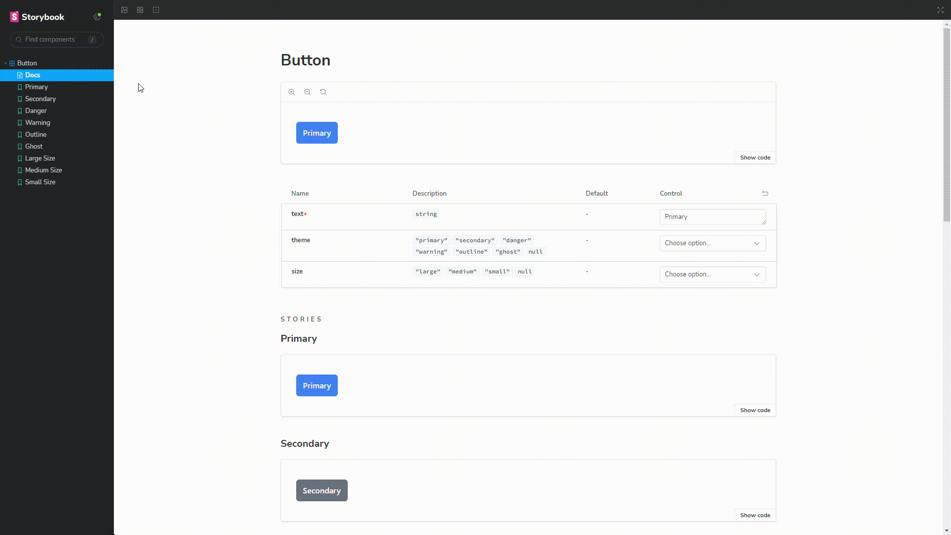
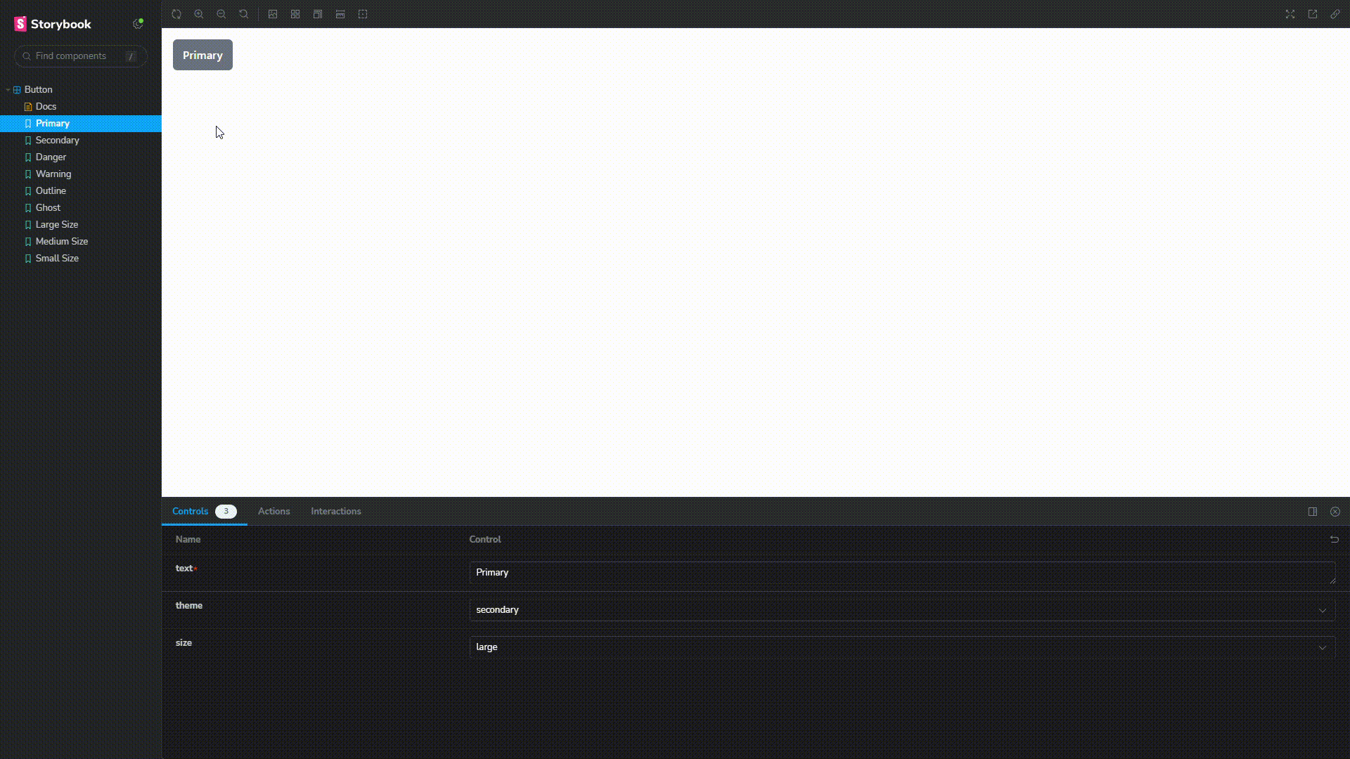
In the Storybook, there are many things to explore, but I won't cover everything. However, there are some basic elements that are important for you to know, such as the Docs section. Here, you can clearly see what props are accepted and used by the button component. This is incredibly efficient, especially when new people join our project. They don't need to open and read through our component code to learn about and understand the available props. The control section also allows us to use all the props in real-time:
Congratulations! Now you know how to create or refactor your React components in a simpler, easily documented, and more robust way. If you know or discover better best practices than those mentioned in combining Storybook with CVA, feel free to leave your comments below, and let's start the discussion! 😁
